Generally, basketball events are arranged by schools and educational institutions so that youngsters can participate and enjoy this game with their friends. However, sports clubs also arrange basketball games for their members. Since basketball is a very popular game and everyone loves to play it, especially in summer vacations, therefore the best way to advertise a basketball event is to design an attractive basketball flyer. It not only spreads information to a vast audience in a short time but also is an easier, cheaper, and more effective way of promoting the event.
You can create an appealing and professional-looking basketball flyer by adding attractive images of a basketball and basketball players in the flyer. A good basketball flyer includes necessary information about the event such as the date, time, and location as well as the names of the opponent teams along with appropriate images attractively and interestingly.
When creating a basketball flyer, always use bright colors and images to make it attention-grabbing. After creating and printing out flyers, it’s time to let the public see it. There are many ways to do so, for example, by handing them out, displaying them on your car window, hanging them up in your area, or getting permission to place a few of them in local shops. Furthermore, it is best to distribute the flyer at least a week before the tournament day. This will allow people to have enough time to plan and prepare for the basketball event.
Printable Basketball Flyer Templates
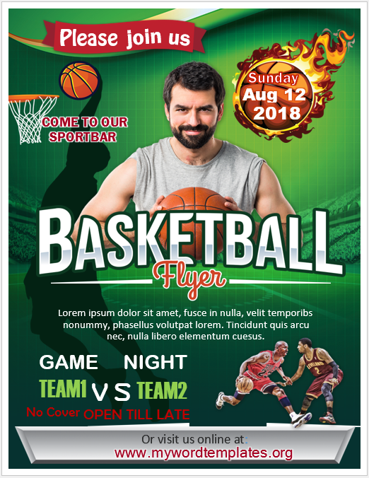
I have created the following Basketball Flyer Templates in MS Word to help my visitors prepare their designs easily.

Download the link for this Green-Themed Basketball Flyer Design.
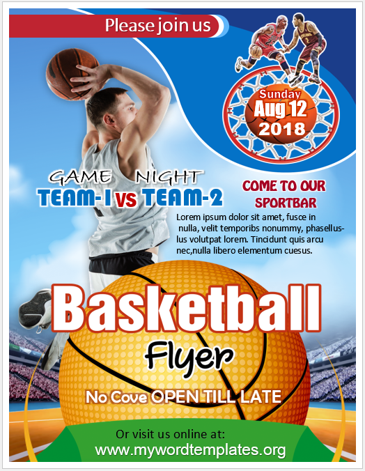
Check out the following Flyer Design that I design to help you create your match campaign easily.

Download the link for this Basketball Flyer Template.
Designing Basketball Flyer – Common Mistakes
However, there are some common mistakes that a lot of people usually make when designing basketball flyers. It is important to avoid them because they can greatly affect the way you want it to be delivered. These mistakes along with their solutions are as follows:
- Including too much information. In general, people don’t read stuff, especially in long paragraphs. Keep it brief, clear yet easily readable, and simple to follow. Always keep white space in the flyer. It not only makes it easier to read but also makes it more attractive.
- Using inappropriate font. The use of the wrong font can make your flyer less attractive. Select a font that does not look messy or vague. Likewise, the font size of all the text on the flyer should not be either too small or too large.
- Using monotonous or uninteresting colors. Colors that clash too much and go over the top can ruin all of your efforts in creating a good basketball flyer. In a nutshell, choosing appropriate images or pictures for a basketball flyer is as important as selecting the right font to highlight your message. Therefore, choose them wisely and carefully.
- Forgetting the most important things. You might be excited to finalize and take out prints of your basketball flyer so that you can start distributing them, but unless you have included the date, time, and location of the basketball event, nobody will come there. Therefore, make sure to include the necessary information in it.
- Following the above guidelines and avoiding common mistakes will help you in designing and creating a good and attractive basketball flyer.
