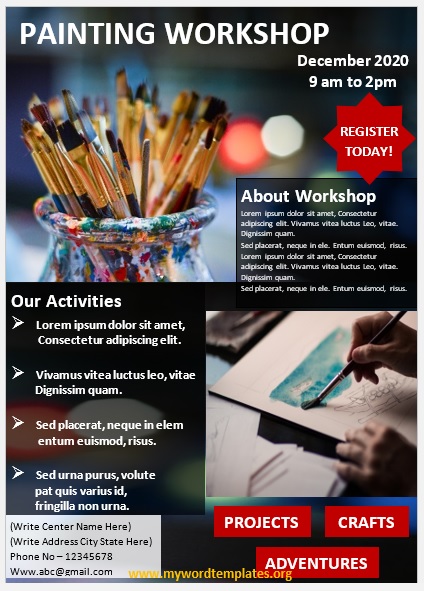
We present here our best 11 Free Awesome designed Painting Workshop Flyer Templates in MS Word.
Painting workshops allow people to come and attend painting classes after depositing a workshop fee. If you want to advertise your new painting workshop, a painting workshop flyer is a good marketing tool as it not only conveys a strong message to the public about a new or existing workshop that arranges painting classes but also helps in getting more members for the workshop classes.
Create a Painting Workshop Flyer
Since there is no hard and fast rule to create a painting workshop flyer, therefore, you can use your imagination to create an appealing painting workshop flyer. All you need to do is to be creative and artistic in designing a flyer. Use bright and eye-catching colors to make it more attractive.
You can also use a painting workshop to raise funds. However, it is quite a challenging job to create a successful painting workshop fundraising event because it needs plenty of organization and advertising. Designing a colorful and attention-grabbing flyer can be of great help in getting the attention of the public.
When creating a painting workshop flyer, make sure to include information about your company or cause. Also, do include the price list and painting workshop event details clearly and noticeably. This way, by using the appropriate images, slogans, and text, you can create a powerful message for your painting workshop to raise a good amount of funds.
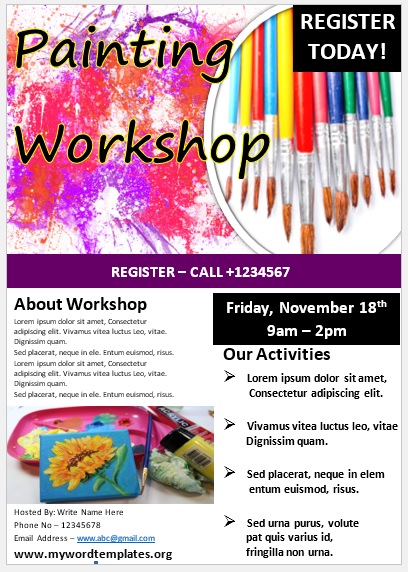
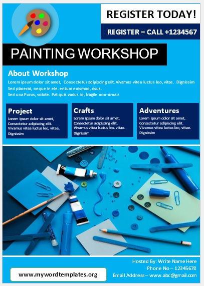
Here is a preview of this Painting Workshop Flyer Template created using Microsoft Word,
Here is the download link for this Painting Workshop Flyer Template,

Free Painting Workshop Flyer Templates
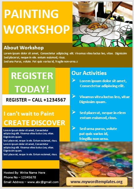

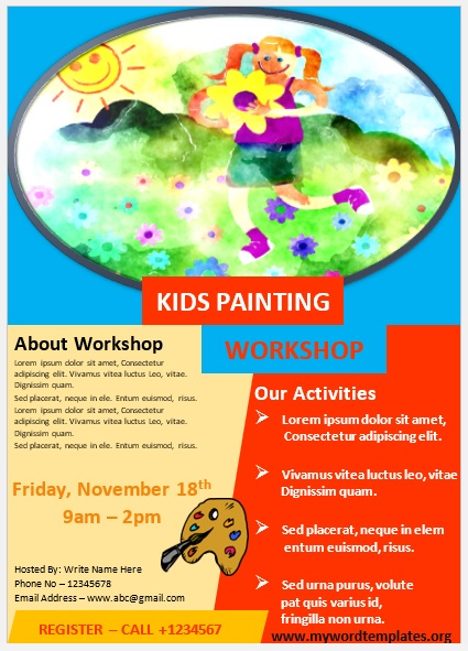
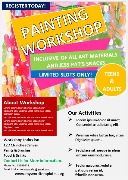


Common Mistakes Create a Painting Workshop Flyer Templates
However, there are some common mistakes that a lot of people usually make when marketing through painting workshop flyers. It is important to avoid them because they can greatly affect your painting workshop business. These mistakes along with their solutions are as follows:
- Including too much information. In general, people don’t read stuff, especially in long paragraphs. Keep it brief, clear yet easily readable, and simple to follow. Always keep white space in the flyer. It not only makes it easier to read but also makes it more attractive.
- Using inappropriate font. The use of the wrong font can make your flyer less attractive. Select a font that does not look messy or unclear. Likewise, the font size of all the text on the flyer should not be either too small or too large.
- Choosing unsuitable colors and images. Colors that clash too much and go over the top can ruin all of your efforts to create a successful painting workshop flyer. Moreover, selecting appropriate images for the painting workshop flyer is as important as selecting the right words to convey your message effectively. Your selected image or images should best represent information in your painting workshop flyer.
- Forgetting the most important things. You might be excited to finalize and take out prints of your painting workshop flyer so that you can start distributing them, but unless you have included the date, time, contact details, and location of your painting workshop, nobody will come there. Therefore, make sure to include the necessary information in it.
- Following the above guidelines and avoiding common mistakes will surely help you in getting the desired results from your painting workshop flyer.

