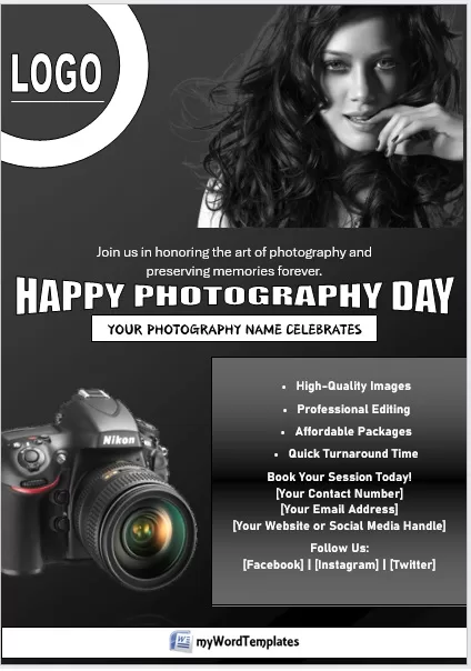
Generally, people use different colors on the flyer to get the attention of the public. However, creating flyers using two colors, i.e. black and white, always gives them a stylish, sophisticated, and professional look as well and it is less expensive than colored flyers. Black and white flyers are widely used to advertise businesses, sales offers, sports events, entertaining shows, family get-togethers, etc.
Since a black-and-white flyer is the best way to introduce and promote yourself or your business in a market, especially if you are new and you don’t have enough budget to give to advertising agencies; therefore, it is important to design and create it attractive and interestingly.
The first step is to identify your target market. This is important because different groups of people have different needs and interests. Understanding their requirements and creating the flyer accordingly can considerably help in increasing and getting their interest.
Secondly, use the best and most attractive photos and images that could not only showcase the highlights of the business or event but also attract your targeted market.
Thirdly, when writing the content of the flyer, keep it short and write it in an informative way. Do include the date, time, address of your organization or event venue, your contact details, and easy-to-follow directions on how to get there.
After creating and printing out flyers, it’s time to let the general public see it. There are many ways to do so, for example, by distributing them outside the cinemas and malls, handing them out, hanging them up in your area, or getting permission to place a few of them in local grocery shops and a supermarket.
Below are some new and professional previews with download link of these Black and White Flyer Templates created using Microsoft Word,

Avoid these common mistakes while drafting Black and White Flyer
However, there are some common mistakes that a lot of people usually make when marketing through black and white flyers. It is important to avoid them because they can greatly affect the way you want to present it, especially if you are advertising your new product, service, or business. These mistakes along with their solutions are as under:
- Including too much information. Generally, people don’t read stuff, especially if it is in small font and long paragraphs. Keep it brief, clear yet easily readable, and simple to follow. Always keep white space in the flyer. It not only makes it easier to read but also makes it more attractive.
- Choosing unsuitable colors and images. Colors that clash too much and go over the top can ruin all of your efforts to create a good black-and-white flyer. Moreover, selecting appropriate images for the black and white flyer is as important as selecting the right words to convey your message effectively. Your selected image or images should best represent the information given in your flyer.
- Forgetting the most important things. You might be excited to finalize and take out prints of your flyer so that you can start distributing them, but unless you include your contact details, your email and/or website address, mobile number, business phone number, and location of your organization or event venue, nobody will come there or nobody will contact you. Therefore, make sure to include the necessary information in it.
- Following the above guidelines and avoiding common mistakes will surely help you in getting the desired results from your black-and-white flyer.

